

🤔 What is backdrop-filter ?
We have filter attribute in CSS to tweak different kinds of properties of an element like contrast, opacity, blurriness, etc. Do you know that we have another property in CSS called backdrop-filter which is dedicated to adding effects only on the background of an element?
📄 Accordion to MDN 'backdrop-filter' is:
The backdrop-filter CSS property lets you apply graphical effects such as blurring or color shifting to the area behind an element. Because it applies to everything behind the element, to see the effect you must make the element or its background at least partially transparent.
✋ How to use it?
backdrop-filter can take single or multiple values. Like below
backdrop-filter: brightness(60%);backdrop-filter: blur(2px) brightness(60%);
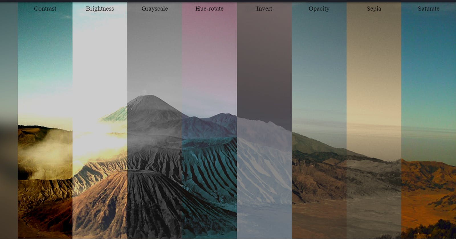
👯 Example Time!
In the example below I have added different kinds of backdrop filters on some parallel elements. Only one background-image was used in the body so you can see how the backdrop-filter is working.
We may not need this attribute in our daily works. But, sometimes design requirements may direct us to use this. For example, I was working on a project for a client where the design had a navbar with blur effect. Here is the site if you want to check: XPad Website
And, if you are interested to know how this can be achieved then here's a codepen for you:
Geoff Graham has an interesting article on this topic which shows how we can achieve a cool blur signup card using backdrop-filter. Check here if you are interested: Backdrop Filter effect with CSS