How to make a gradient border just in 2 steps
Updated
•1 min read
A
Hi, Anower Jahan Shofol here. I am a senior frontend developer from Bangladesh. Right now I am working remotely as a remote developer and doing freelancing. You can hire or consult me to join your team to accomplish your business needs.
😥 We don't have any straight attribute on CSS to get a gradient on any elements till now.
😉 But, with a little technique, we can achieve this.
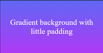
Add a container for the element on which we want a border. And, then add gradient background on that container. Also, add some padding to that container. This padding will be the border-width of the element.
Here's what the HTML will look like:
<div class="container">
  <div class="box">
  </div>
</div>
And, CSS for the container will be like this:
.container {
  background: linear-gradient(0deg, #ae3af5 0%, #6067f3 100%);
  padding: 0.5rem;
  width: 400px;
  height: 200px;
}
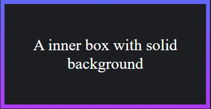
📌 Second step
Add a solid background on the element on which we want the gradient border.
CSS for the inner element:
.box {
  background: #1d1e22;
  width: 100%;
  height: 100%;
}
🎉 Voila! We are done!
Here is the codepen link to see the full code:
That's all for today. See you in another post.
🧧 If you like this post you can check my other posts on here: https://shofol.hashnode.dev
💌 Follow me on Twitter to know more about my works: https://twitter.com/jahananower
☕ If you like the article, you can Buy me a coffee


