

Have you noticed cool gradient progress bars around the internet? I have seen many cool websites using it. Recently I was going through JoshWComeau's 'The Joy of React'. The course platform is so unique and full of resources. There's a gradient progress bar in the course platform. I liked it so much and made a clone of it. So, how can we achieve that? Let's see-
HTML First:
We need two divs for creating a gradient progress bar. One div is for the background and another one is for showing the progress with gradient colors. So, the HTML will be as simple as this-
<div id="progressbar" role="progressbar" aria-valuemin="0" aria-valuemax="100" class="progressbar">
  <div id="progress" class="progress"></div>
</div>
Let's do some CSS!
If you look at the code above you can see the ARIA options. Those are important for users with less accessibility and screen readers. We are not using the HTML progress element for our progress bars. That's why we need these ARIA options for those users.
Let's see the CSS now. At first, we will create the progress bar/ progress container with a gray background.
.progressbar {
  width: 50vw;
  border-radius: 10px;
  overflow: hidden;
  height: 20px;
  background: var(--color-gray-200);
}
The progress container will look like this now-

After that let's stylize the progress section. The CSS will look like this now-
.progress {
width: 100%;
height: 100%;
will-change: transform;
transition: clip-path 0.25s ease-out;
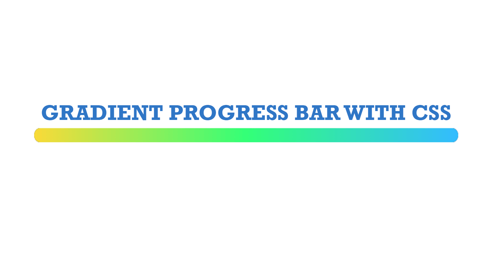
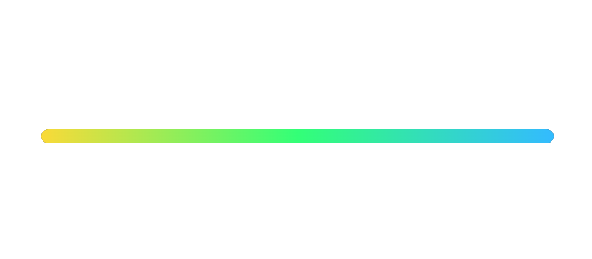
background: linear-gradient(
90deg,
rgb(250, 218, 56),
rgb(51, 255, 119),
rgb(51, 187, 255)
);
}
Now, the progress bar is looking like this-

Make it live!
So, what should we do now? I think you can guess it. We need to animate the gradient progress portion to get a feel of progress. Now, let's do some JS!
const progressbar = document.querySelector("#progressbar");

const currentProgress = document.querySelector("#progress");

let progress = 0;

// we are increasing the progress by 5 after every 1 second.
const timer = setInterval(() => {
  if (progress >= 100) {
    progress = 0;
  }
  progress = progress + 5;
  // setting the progress value in the custom progress bar
  progressbar.setAttribute("aria-valuenow", progress);

  // This is the intersting part! We are only showing the current progress section within the progress container.
  currentProgress.style.clipPath = `polygon(0% 0%, ${progress}% 0%, ${progress}% 100%, 0% 100%)`;
}, 1000);
And! Done. It will look like this-
Hmm... But How?
The tricky part here is the clip-path property. If you see the progress bar view before the JS, it was like this-
Now what are we doing with clip-path? See below-
So, as we are progressing from 0 to 100 we are showing more and more part of the progress bar. If you are not much familiar with clip-path property then I would suggest this great article by Ahmad Shadeed-
Understanding Clip Path in CSS
That's it for now! Let me know where I should improve the article.
Follow me on other platforms-
Twitter Handle
LinkedIn Handle
If you like the article, you can Buy me a coffee ☕
I'm also available for new freelance projects or remote jobs.