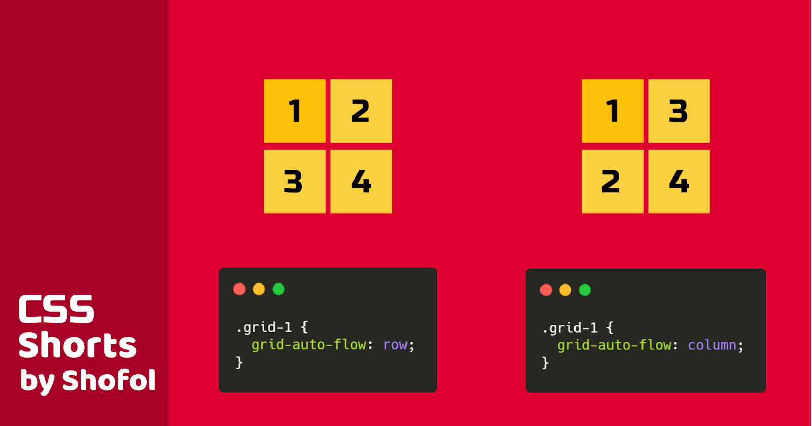
CSS Grid is awesome! We can achieve complex layouts using the CSS Grid. So, here is a short story about one of the CSS Grid's properties called grid-auto-flow.
What is grid-auto-flow:
When you start making a grid layout, you'll see that the elements are getting arranged row-wise. Like the picture below. So, this is the default algorithm of the CSS grid to arrange the elements in a grid.

But, in a recent project of mine, I got a design where there was a group of projects. But, according to the design the projects should distribute column-wise rather than the default row-wise distribution. This was a new problem for me. Then I dig dive into the CSS grid and found the grid-auto-flow property. It just helps you to control how new elements should distribute in a grid.
How to use it:
It can take one value or two values. Like this:
gird-auto-flow: row
gird-auto-flow: column
gird-auto-flow: dense
First, two are self-explanatory. row is used by default. If you use column then the elements will be arranged column-wise.
But, what is dense? dense means if you have a shorter element in the list it will take place in empty space before it in the grid. This makes the arrangement out of order but good for masonry layout which we see in the list of images on Pinterest. I'll explain it in more detail in another post.
FYI, grid-auto-flow can take two values together like this:
grid-auto-flow: row dense
grid-auto-flow: column dense
Here is an example illustrated below where you can find the difference. The example idea is taken from MDN. Thanks to Emmy Leke for mentioning the example of dense.
That's all for today. See you in another post!
If you like the article, you can Buy me a coffee ☕
